The Vault · Free Toolkit
The Claude toolkit
I actually use.
The documents, the open source tools, and the one prompt that builds you a command center. Everything on this page is free.

read
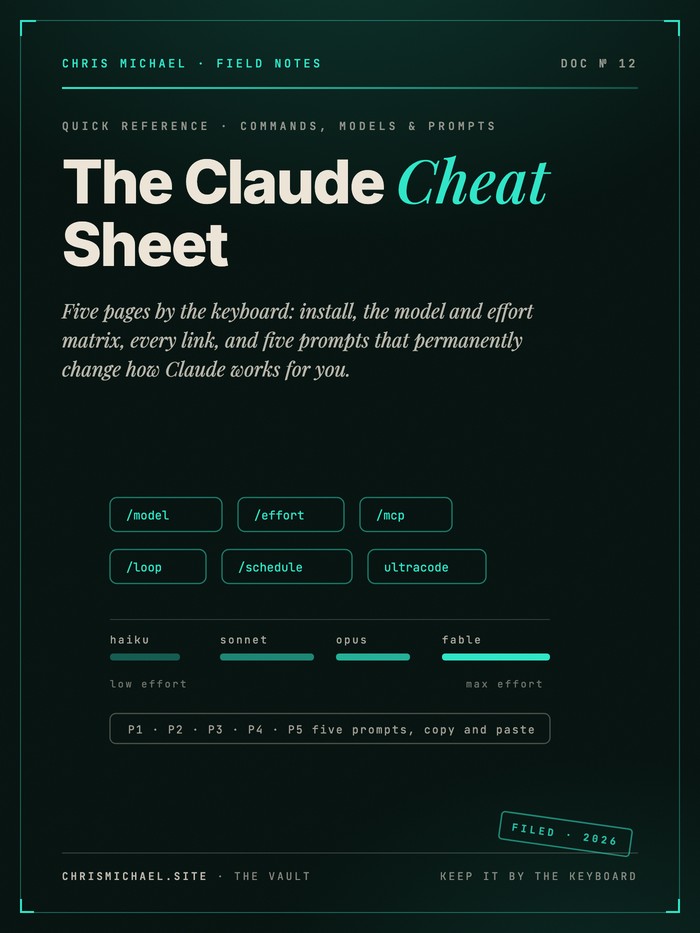
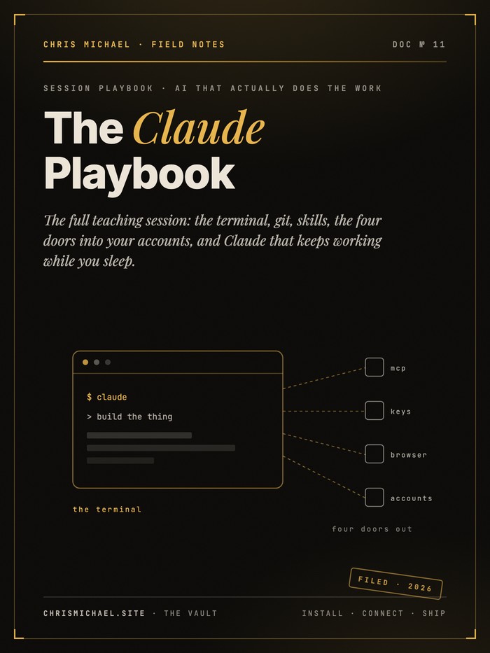
New to running Claude in the terminal? Start with these.
Both documents came out of a live session, and between them they cover install, the commands worth knowing, and the prompts that permanently change how Claude works for you. Nothing to sign up for. Download them, read them, keep them by the keyboard.
One line to install. The cheat sheet below covers the rest.
clone
The rest of the toolkit.
Four open tools I built to make Claude Code run better, all free and MIT licensed. They live in one repo, so there is only one link to keep.
paste
One more thing: the dashboard prompt.
One command center for everything you are working on, built from your own files, not from a template. Paste the prompt below into Claude Code and it builds the whole thing.
- A knowledge graph of your notes, drawn from the real links between your files, not invented
- Your actual projects, pulled from your repos with true last-commit dates
- A calendar and agenda, a metrics view, and quick links to everything you open daily
- A command palette on Cmd K that searches every note, view and project
- No dead buttons. Every control works, and it runs with the wifi off
- You need Claude Code running in your terminal. If you do not have it yet, the cheat sheet above installs it in one line
- Run it in your home folder so it can see your notes and your repos
- Answer its questions. It is supposed to ask, and the answers are what make the result yours
- When it finishes, ask it which numbers are real and which are samples. It will tell you
Build me a single self-contained HTML dashboard called my personal command center. It is a showcase piece: it has to look genuinely expensive, and every control in it has to actually work. No dead buttons, no placeholder panels, no lorem ipsum.

STEP 1, BEFORE YOU WRITE ANY CODE: find my real data.

Do not invent my life. Inspect my machine and ask me for what you cannot find. Specifically:

1. A notes vault or wiki. Look for an Obsidian vault, a folder of markdown files, a Logseq graph, or any directory of interlinked notes. If you find one, parse the actual links between files to build a real graph. For Obsidian style vaults extract every [[wikilink]] and keep only the edges whose endpoints are real files, so unresolved links do not become phantom nodes. Read each note's frontmatter description if it has one and use it as that node's summary. Compute each node's degree from its real link count.
2. My code projects. Walk my repo folders, read each git remote URL and the last commit timestamp, so the projects view and the recent projects list are true.
3. My websites and the tools I open daily. Ask me for these if you cannot infer them.
4. My email address, so the mail button opens to the right account.

If I have no notes vault at all, tell me so and offer these fallbacks in order: build the graph from my git repos and their dependencies, or from my folder structure, or ask me for a list of my projects and how they relate. Never silently fabricate the graph.

Everything structural should be real: the graph, the project list, the repo timestamps, the note summaries, the links. Financial figures and calendar entries can be realistic sample data, since this is a demo, but tell me clearly which numbers you invented.

HARD CONSTRAINTS

One HTML file. All CSS and JavaScript inline. Zero network requests: no CDN scripts, no external stylesheets, no web fonts, no remote images. It must work with the wifi off, opened straight from disk. Vanilla JavaScript only, no framework, no build step. Use canvas for the graph and hand written inline SVG for the charts. Target roughly 2000 to 2500 lines and do not truncate or leave TODO comments.

THE CENTREPIECE: AN OBSIDIAN STYLE KNOWLEDGE GRAPH

This is the thing people will remember, so it gets the most care. Force directed, drawn on canvas, and it must feel like Obsidian's graph view:

- Node radius scales with real link count, so hubs are visibly large and leaves are small.
- Scroll wheel zooms toward the cursor, not toward the centre. Dragging empty space pans. Dragging a node moves it and pins it while held, then releases back into the simulation.
- Labels behave like Obsidian: they fade in as you zoom in, and low degree nodes hide their labels when zoomed out so the view never turns into a wall of text. Draw a dark stroke behind label text so it stays legible over edges.
- Hovering a node highlights it and its direct neighbours and dims everything else, with the lit edges drawn as a gradient between the two node colours.
- Selecting a node must NOT dim the graph. Dim only on hover. If selection dims, the default state looks broken.
- A physics simulation with repulsion between nodes, spring forces along edges, a gentle pull toward centre, velocity damping, and a speed clamp so nothing flies off screen.
- A collapsible settings panel, opened by a gear icon, holding real live controls: a text filter, a local graph toggle with a hop depth slider, colour mode switch (by group, by link count, plain), per group show and hide toggles with counts, and sliders for node size, link width, label fade, repulsion, link force, centre force and link distance. Every slider must visibly change the graph.
- A fit to view button, a re run layout button, and a details card that appears on click showing the node name, its real summary, its group and its link count.
- Clicking a node opens that note in its source app via a deep link, for example obsidian://open?vault=VAULT_NAME&file=NOTE_NAME with both values URL encoded. Put a switch in the settings panel to turn that behaviour off, defaulted on, so it can be disabled during a live demo when focus stealing is annoying.
- Subtle animated motes travelling along edges connected to the hub, and a soft pulsing glow on the hub node. Keep this tasteful, not a fireworks display.

VIEWS, ALL REACHABLE FROM A CLICKABLE SIDEBAR

The sidebar is real navigation, not decoration. Every item switches views, keyboard shortcuts 1 through 9 jump between them, the URL hash updates, and the browser back button works.

Critical: also listen for the hashchange event. Changing only the fragment on an already loaded page does not re run the script, so without that listener deep links and the back button silently do nothing.

1. Overview: a row of headline metric cards, the knowledge graph, a compact month calendar, an upcoming agenda list, a live activity feed, and a short quick links list.
2. Knowledge graph: the same graph, full bleed, filling the viewport.
3. Metrics or revenue: bigger charts, a trailing twelve month trend, a ranked breakdown, and a short written interpretation of what the numbers mean.
4. Calendar: a full month grid where each day cell shows actual event chips with a coloured left border, plus a scrollable full agenda beside it.
5. Projects: a card grid built from my real repos, each card linking to its remote, showing the true last commit date rendered as a relative time like 3 days ago.
6. Quick links: grouped columns for my own websites, my most recent code projects, my daily tools, and my business or admin tools. Every entry a real working link.
7, 8, 9: three more views that fit how I actually work. Ask me what belongs here rather than guessing. Automation status, clients, habits, reading queue, whatever is true for me.

The graph should live in one canvas element that you physically move between view containers when switching, so its layout and camera state survive navigation instead of resetting.

COMPONENTS AND INTERACTIONS

- A top bar with a time aware greeting (good morning, afternoon, evening), a live ticking clock and date, a button that opens my email, a command palette trigger, and my initials as an avatar.
- At least one status toggle button that flips state on click and turns green when active, with an ON and OFF label and a small confirmation toast.
- A command palette on cmd or ctrl K: a dimmed backdrop, a text input, fuzzy filtering across every graph node, every view and every project, arrow key navigation, enter to activate, escape to close. Selecting a node should jump to the graph and centre the camera on it.
- Headline numbers that count up from zero on first view with an ease out curve, formatted correctly for currency, thousands and plain integers.
- A trend chart with a dashed crosshair that follows the cursor, snaps to the nearest data point, and shows a floating tooltip. Label only the peak and the latest point directly, never every point.
- Horizontal bars that animate their width on reveal, with the label and value always visible as text.
- An activity feed that prepends a new entry every few seconds, ages the timestamps on the older rows, and caps its length.
- Hover tooltips on calendar days listing that day's real events.
- Multi day spans, such as travel or holidays, highlighted as a continuous tinted run across the calendar with its own key underneath.

VISUAL DESIGN

Dark, restrained, expensive. Not a neon gamer theme and not flat bootstrap grey.

- Page background near black, cards a slightly lighter warm charcoal, with a soft vertical gradient on card surfaces and hairline borders at about 9 percent white.
- A slow drifting aurora backdrop: three large blurred radial gradient blobs at low opacity, animated over 30 to 50 seconds, plus a very faint inline SVG noise grain overlay at around 3 percent opacity. Both must be pointer events none.
- One accent colour used consistently for the active nav item, focus rings, the hub node and primary actions. Pick something with warmth and personality rather than default blue, and ask me if I have a brand colour.
- System UI font stack only, no display faces. Tabular figures for anything that lines up in a column, proportional figures for large standalone numbers.
- Generous but not wasteful spacing, a consistent radius around 12 to 16 pixels, and shadows used sparingly for depth rather than drama.
- Honour prefers-reduced-motion by disabling all animation and transitions.

COLOUR CORRECTNESS, DO NOT SKIP THIS

Categorical colours must be readable by colour blind viewers, and a graph is the hard case because any two nodes can end up adjacent, so every pair has to hold up, not just neighbours in a legend.

If a palette validator is available to you, run it and fix whatever fails rather than reasoning about it. Otherwise use this palette, which has been checked for all pair separation under simulated protanopia and deuteranopia on a near black surface:

blue #4b7ef4, green #2f9b79, magenta #c54ac4, gold #c98500, violet #7042be, red #e04b4c, deep blue #0e6a9b, neutral #a8a69c

Supporting tones: page #0b0b0a, card #141413, raised #1c1c1a, primary text #f5f4ef, secondary text #c3c2b7, muted text #8b8981, gridlines #262623.

Rules that hold regardless of palette: never let colour be the only carrier of meaning, so every node keeps a text label and every bar keeps a visible label and value. Use one hue light to dark for magnitude, never a rainbow. Never build a chart with two different y axes. Keep a legend whenever more than one series is present.

NUMERIC INTEGRITY

Every number on screen must survive someone with a calculator.

- The monthly figures in a trend chart must sum to the annual total shown elsewhere.
- A breakdown must sum to the total stated in its own heading.
- If two figures I ask for are arithmetically incompatible, do not quietly fudge one. Change the framing so both stay true, for example by relabelling a panel from monthly to quarterly, and then tell me plainly what you changed and why.
- Derive relative dates from real timestamps at runtime rather than hardcoding phrases like two days ago, which go stale.

VERIFY IT, DO NOT ASSUME IT

Do not hand me the file until you have actually looked at it rendered.

- Many browser automation tools block the file protocol, so serve the folder over a local HTTP port and open that address instead.
- Screenshot every single view and inspect each one. Fix what looks wrong before telling me it is done.
- Check the browser console and resolve every error apart from a missing favicon.
- Assert that document.documentElement.scrollWidth is not greater than clientWidth, since horizontal overflow is the most common layout break and is easy to miss.
- Verify the arithmetic programmatically by summing the arrays in the page and comparing them against the displayed totals.
- Confirm any deep link URL you generate resolves to a file that genuinely exists.
- Kill the local server and delete stray screenshots when you finish.

If a test result surprises you, find the real cause before patching. Do not fix by guessing.

PITFALLS THAT HAVE ACTUALLY BROKEN THIS BUILD BEFORE

- Long text inside a CSS grid cell with white-space nowrap forces tracks wider than the container and pushes columns off screen. Use grid-template-columns repeat(7, minmax(0,1fr)) and set min-width 0 on the cells.
- Navigating to a hash on an already loaded page does not re run scripts. Add a hashchange listener.
- Browsers cache aggressively while you iterate. Append a changing query string when you reload during testing.
- Dimming the graph on selection rather than only on hover makes the default view look dead.
- Label fade thresholds tuned too aggressively hide every label and the graph reads as anonymous dots. Tune this by looking at a screenshot, not by intuition.
- Text pulled from my own files may contain characters I do not want displayed. Ask me if I have typography rules, and sanitise imported strings accordingly.

DELIVERY

Put the finished file somewhere sensible in my projects folder along with a short README explaining how to regenerate the graph data when my notes change. Then put a working copy on my desktop.

On macOS specifically: do not create a .webloc bookmark file or a Finder alias as the desktop shortcut. A .webloc pointing at a local path refuses to open, and Chrome cannot resolve a Finder alias because it tries to parse the alias file itself as HTML. Place the real HTML file on the desktop, or a POSIX symlink, and then confirm it truly opens before telling me it is ready.

Finally, tell me in plain language which figures are sample data and which parts are drawn from my real files, so I never accidentally present invented numbers as fact.
The part I do not give away
What I build for companies,
I can build for you.
If you run a team, and the business is doing $200k or more. Below that line, what you already have is enough. This material plus your own effort gets you to $200k, and I would rather you keep your money. Hire me when the bottleneck stops being effort and starts being strategy.
Everything on this page is tools, and tools are the easy part. What decides who wins a category is behavior: how you build authority, how people decide, and what actually moves your bottom line. That is the work I do with companies.
I train you and your team to be serious contenders in any industry, and I build you into a proper CEO.
Your business should be outperforming everyone in your category. Let's make it.